1.Introduction
In today's competitive skin care and cosmetics market, the success of a brand is critical to the survival and growth of a company. However, as consumer needs and market trends continue to change, brands need to constantly adapt and innovate to maintain a competitive edge. Therefore, in-depth analysis and research on brands has become particularly important.
Korean brands are popular among young women in Korea and Asia because of their natural ingredients, suitable price point, and Asian skin type. Since women in this age group are in the most critical period of consumer concept shaping, it is necessary to use skincare products for their own beauty or for the appreciation of others, and they are willing to make more positive attempts.
Based on the above analysis, we selected the Korean skincare brand Innisfree to analyze the consumer behavior of young women, to identify the factors that influence the consumer behavior, and to explore the performance of the brand design, consumer decision-making process and trends, in order to provide valuable insights on brand management and marketing. It will provide valuable insights into brand management and marketing, and will help companies to retain old customers, attract new customers, and make marketing decisions to achieve customer satisfaction and customer loyalty, and ultimately achieve the goal of sustainable profitability.
2.The Importance of Visual Presentation of Brand Touchpoints in Brand Marketing
Brand touchpoint design refers to the design and management of various touchpoints where brands encounter consumers to activate the communication and promotion of brands and products. These touchpoints can include brand identity, product packaging, advertising, social media, customer service, retail environment, etc. The final objectives to increase brand awareness, increase consumer favorability of the brand, and promote consumer purchase behavior, thus achieving increased brand value and sales growth.
Brand touchpoint design needs to consider consumers' needs, preferences, behaviors and psychology, as well as the competitive environment, market trends and brand strategies, to design various touch points with brand characteristics that match consumers' needs, and to achieve brand-consumer interaction and connection through various means. Through fine brand touch point design, it can help brands build a positive brand image, increase brand loyalty, promote sales growth, and improve market share and competitiveness.
3. Constructing Brand Touchpoints Using Maslow's Hierarchy of Needs Theory
In the current competitive market, it is crucial to understand consumers' needs and preferences. Maslow's Hierarchy of Needs is a classic psychological theory that can help companies gain an in-depth understanding of consumers' needs and thus develop more precise marketing strategies. Therefore, this paper analyzes the Maslow's hierarchy of needs of consumers of Innisfree and its affiliated brand groups and explores the competitive advantages of its affiliated brand groups and the psychological needs behind consumers' purchasing behavior.

Figure 1: Maslow's hierarchy of Needs.
Table 1:Maslow's hierarchy of Needs in skincare.
Maslow's hierarchy of Needs |
Maslow's hierarchy of Needs in skincare |
|
fundamental needs |
Physiological needs |
Moisturizing, moisturizing, sunscreen, cleaning and makeup products |
safety needs |
Brands need to make sure their products are safe |
|
social needs |
Beautify the skin, improve the appearance of beauty |
|
specific needs |
Esteem needs |
The purpose of consuming such products is to increase self-esteem and self-confidence |
Self-Actualization |
Helping consumers achieve their ideal image |
|
4. Take Innisfree as An Example to Analyze the Visual Expression of Its Brand Touch Points
Innisfree is a well-known natural skin care and cosmetics brand in South Korea, known for its use of natural ingredients and eco-friendly philosophy. Here are some visual representations of the Innisfree brand touchpoints to analyze the visual design elements of its success.
4.1. Brand Identity and Logo:
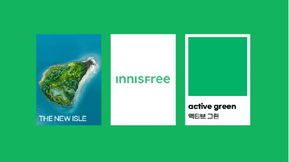
The Innisfree logo is a simple green plant pattern, usually a green leaf. The logo emphasizes the brand's natural and eco-friendly character, which is in line with its philosophy of natural skin care products. Green represents health, vitality and natural beauty, which is in line with the brand's philosophy.

Figure 2: nnisfree ’s THE NEW ISLE.
4.2. Product Packaging:
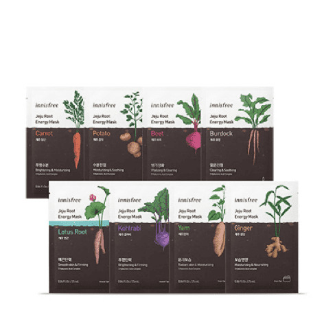
Product packaging design:The packaging design of Innisfree products is very simple and clear. Most of the products use a white background, like the Esperanto, but use more natural elements, such as leaves, flowers, plants, etc., to represent the brand's focus on natural ingredients and environmental philosophy. At the same time, the main ingredients and effects of the products are often printed on the packaging, which is convenient for consumers to purchase.


Figure 3: The brand uses patterned packaging.
4.4. Store Design:
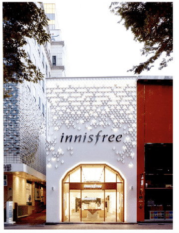
Innisfree's store design also has a natural theme and uses a lot of wooden elements, such as log floors and wooden shelves, to create a natural and comfortable atmosphere. Natural elements such as plants and flowers are also often used in the store decoration to add life and vitality to the store. In addition, the brand also sets up DIY areas and trial areas in the stores to provide consumers with a more comprehensive experience.


Figure 4: Innisfree Seoul Flagship Store.
4.5.Font Design:
The font design of Innisfree is very simple and bright. Some round and soft fonts are used in the former logo to make the brand image more cordial, relaxed and warm. After updating the logo, a more modern and simpler font design is used to retain the brand's consistent green main color, and highlight the brand's natural, environmental protection, sustainable development concept. The new logo, which is more compact and harmonious overall, is in line with modern design trends, helping to enhance brand image and awareness, and helping the brand to update its products to a modern skincare model.

Figure 5: Innisfree's logo font design.
4.6.Typography Design:
Innisfree's products are simple and generous in both poster promotion and product packaging layout typography, focusing on highlighting product features and brand logos, as well as providing clear product information so that consumers can quickly identify and choose the right product for them. Its product packaging usually uses a large blank interval to create a simple, natural feeling. Blank spacing can effectively improve the visual impact of the product, making it easier for consumers to focus on the product itself, and helps to convey the brand's environmental philosophy and natural theme.


Figure 6: Innisfree's main 3 efficacy products.
4.7.Advertising:
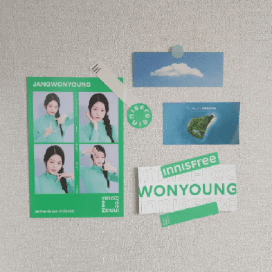
Innisfree's advertising campaign focuses on nature, using beautiful natural scenery and elements to demonstrate the efficacy of the product and the brand concept. The brand also cooperates with some nature conservation organizations to actively promote the concept of environmental protection and increase the brand's sense of social responsibility. At the same time, brands often cooperate with popular Korean artists to launch limited-edition products and carry out advertising and marketing campaigns on social media to attract consumers to become their potential customers.

Figure 7: Innisfree global spokesperson - Jang Won-young (idol).
5.The Relationship Between Cultural Code and Brand Marketing
There is no doubt that Innisfree is a successful brand in the Korean skincare market and in overseas markets. Its brand contact point design has more intuitive visual expressions, intuitively making consumers feel the brand's natural, safe, and environmentally friendly philosophy through colors, fonts, packaging, posters, and promotions, aided by abstract visual expressions, using poetry as the brand name, and focusing on using natural images to directly display the pure natural ingredients in its brand to create a fresh, natural, and friendly brand image. This design style reflects the brand's environmental philosophy and natural ingredients, and is in line with modern consumers' pursuit of health, environmental protection and nature. The success of the brand also lies in the fact that the systematic visual performance shaped by the brand has laid the foundation for the future development of the brand to be durable and continuous, and also makes the brand more prominent and easily recognizable in the market. This also establishes the General Culture Code for such cosmetic brands.
6.Conclusion
In this paper, we delve into the pivotal role of visual representation in brand marketing through brand touchpoints. We emphasize the significance of visual design in attracting, retaining, and influencing consumers, and how brand touchpoints can be constructed by addressing Maslow's hierarchy of needs. Using Innisfree as a case study, we analyze how a successful brand conveys its core values through visual design, highlighting the relationship between the consistency of brand touchpoints and the establishment of brand identity and consumer loyalty. Additionally, we explore the interconnection between cultural codes and brand marketing, underscoring the impact of culture on brand touchpoint design and the importance of cultural sensitivity.
This study underscores the complexity and multifaceted nature of brand touchpoint design, extending beyond visual aesthetics to encompass brand core values, cultural backgrounds, and consumer demands. In a fiercely competitive market, brands must leverage visual design to guide consumers' emotions and decision-making while adapting to diverse cultural backgrounds. This research offers practical guidance for brand marketing on how to construct robust brand touchpoints, forge deep emotional connections with consumers, and navigate cross-cultural communication.


